Learn How to do a Concept Art Sketch in Corel Painter with Bob Cheshire
Bob Cheshire is the passionate concept artist behind Hollywood blockbusters such as Star Wars: The Rise of Skywalker, several Avengers movies, and the upcoming Jurassic World: Dominion. In the following tutorial, Bob demonstrates his process for creating a concept art sketch in Corel Painter.
For this exercise, Bob is working with a very loose brief – a generic sci-fi street corner, possibly creating a bodega or an open street bar. Read on to find out how Bobs sets the mood, general direction and feel in response to the brief.
1. Rough sketches
 I start with sketches in a sketchbook. In this case they’re done with a black biro pen, a Sharpie and a grey marker. These are very rough! They give me a basic sense of composition, and often if a composition works as a thumbnail it’s probably going to work as painting. So, these initial sketchbook thumbnails define the absolute basics like areas of tone, and a rough idea of shapes and mood in a simple way.
Remember that when working at this basic level, your choice of shapes and tone will dictate the overall mood all the way through to the end.
2. Blocking-in the basic shapes
Now I want to open Corel Painter and start blocking out the basic composition. Again, I deliberately want to keep it as fast as possible and loose – so I’ll use the Concept Art brush found under Pastels which is great for blocking in areas of tone, and my other favourite, the Soft 2B pencil, which is without doubt my favourite for sketching and my most used tool in Corel Painter. Speed is good here because you’ll find your intuition kicks in so if you want to make changes, do it!
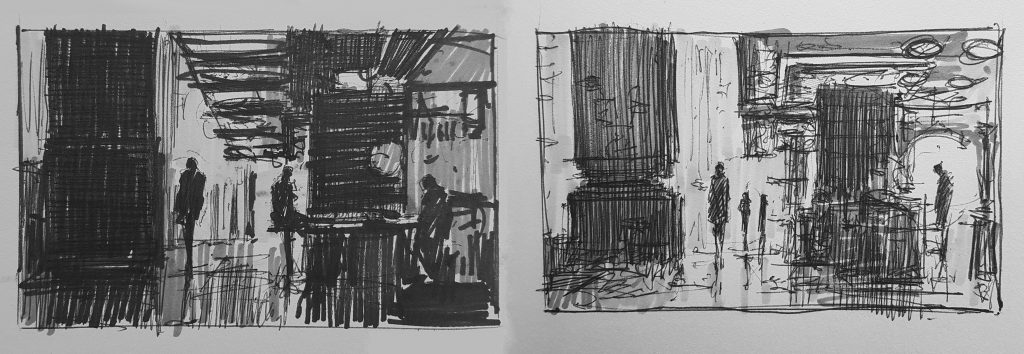
3. Getting the composition right
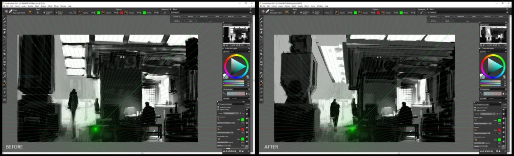
I want to quickly firm up the perspective. I haven’t got time to plot it all out so this is where I can use another tool in Corel Painter – the perspective grid. This is a tool that comes with 1, 2 and 3-point perspective presets but are customizable to your viewpoint and composition. In this example, I’m using a very simple 1-point perspective grid just to get me going and the rest I’ll do by eye. I’ve put the before and after side by side so that you can see how the perspective tool has helped me firm up where those edges and so on should be. Note how it’s helped me shift the canopy round and tightened up the central column.
Using this tool also highlighted a problem with the left hand column. In the ‘before’ sketch my left hand column is just a black, flat, featureless block which is really boring and too heavy for this image. The solution, which you can see in the ‘after’ image, is that I’ve changed the column for a cable anchor. This creates a much more interesting profile and better positive and negative space.
4. Creating Contrasts
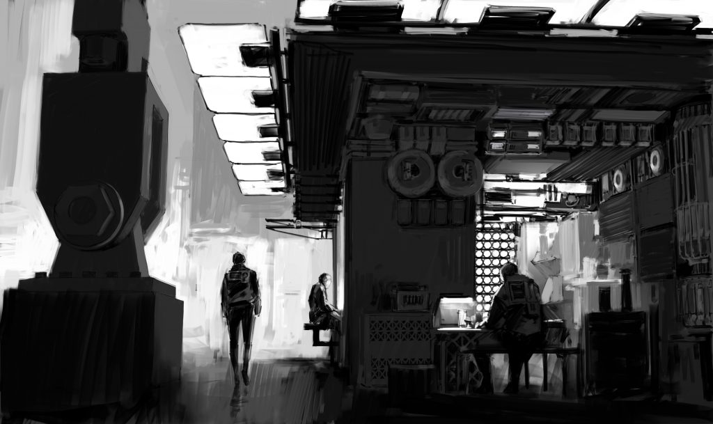
The eye likes contrast…light against dark, round against square, soft against hard and so on. So, in a sketch like this I’m really simply reacting to each shape and creating contrasts wherever it’s needed, sometimes introducing shapes simply because it contrasts with the previous one.
5. Introducing colors
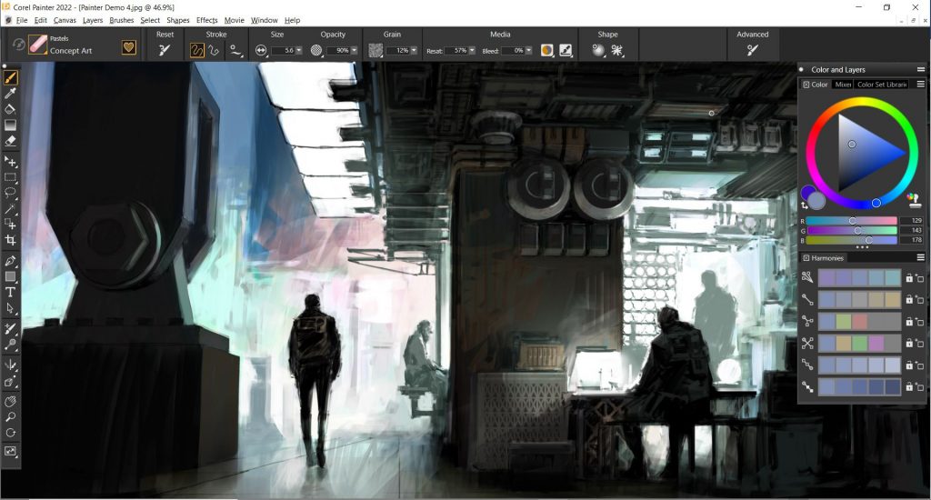
It’s usually unnecessary to take an initial sketch in to colour because it’s more likely that you’re assessing shapes, spaces, proportions etc, but for this demonstration I’m going to assume that I’ve been asked for a colour study too, to push the language about lighting and mood a bit further.
So, sticking with the Concept Art brush and Soft 2B pencil I’m going to start blocking in basic colour. Corel Painter has another very useful tool – Harmonies. This is a fast and convenient way to pick out colours which are harmonious (and complimentary) based on your selected color. You can see that I’m mostly using a teal blue/green, an overused and safe ‘sci-fi’ colour, but I grew up in the 80’s with movies like Blade Runner – it’s just part of my visual vocabulary. I’ll use the harmonious pinks that Corel Painter has selected automatically as an accent colour in the background.
6. Fine-tuning
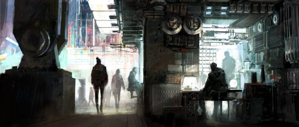
If you’re drawing and painting for a conventional film, there’s little point working towards something that looks handsome in a deeper ratio if it’s ultimately got to work in 2.35:1 format, which is typical for conventional movies. I would normally set up the canvas at 3485X1483 pixels to achieve that aspect ratio or crop the image as I have done in this case.
7. Final touches for getting the mood right
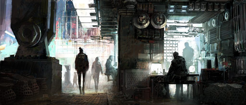
In a final push to bring a little vigour and speed back into the painting I’ve used Corel Painter composite modes such as Overlay and Hard Light to bring in a little photo reference, specifically the tile floor and the baskets left and right of the frame. This helps ‘push’ the believability of the frame as it helps communicate more surface quality…so many choices are made based on the way light will play across a surface because it photographs well.
This would represent a good initial sketch that communicates mood (if you listen carefully you can hear the bustle of people, music, maybe a siren or people arguing) and good enough to start a conversation about whether it’s got potential for the story that’s being told and what works and doesn’t work, what will need to change and what the next version should explore.