Making of: Rolling On by Tamás Gyermán
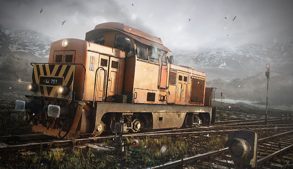
This image was inspired by public transport. Cold outside, but still warm enough inside. My train driver is on a trip through a mid-winter landscape but the train’s engine is providing lots of heat. Enough that the driver needs to drink a cold beer, but I’d prefer that he checked the rail switch instead.
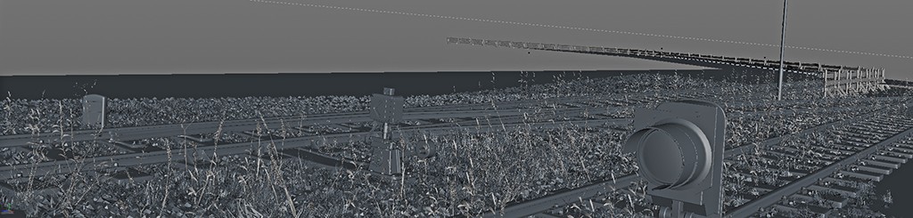
The main object of the image is an old diesel train. It’s an M43, a style used in my region. This train was created as a full 3D object for the scene, with subdivison topology, UV maps, textures and of course shaders. An important part of the image is the rail switch which was also created as a 3D object.
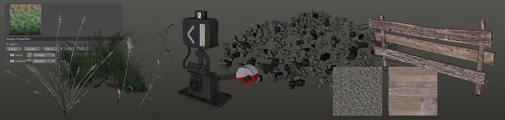
There are additional elements in the image, such as the controller lights and wooden fence. These elements used procedural, tiled textures with matte-painted details to save time.
The last elements of the image are place-holders and silhouetted geometries to help the matte-painting process for the environment.
I used Cinema 4D and Maya for modeling, unwrapping and surfacing. The train was textured in Bodypaint and Photoshop, and the environmental elements were created with Mari. I used ZBrush to get fine details and Cavity maps and I used V-Ray to render the elements out. Substance Painter was a huge help in texturing, and gave me really good dirt and edge damage/wear masks. I saved so much time using Substance Painter! I spent a few hours to fix anomalies, but Substance did a really good job.
In CGI I always love creating images that tell a story, and make the viewer feel an emotion. I love to work with mood and depth, color and composition. These are the areas I focus on, and not on the asset creation. I hope you will enjoy this making of: Rolling on.
The creation
Step 1: Modeling
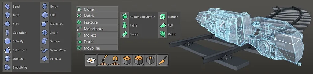
Modeling tools
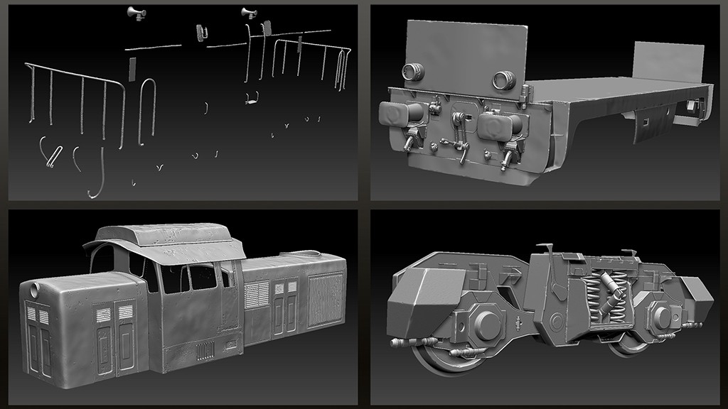
I use traditional tools such as extrude, bevel, inset, brush, interactive cut and fill holes. The train was created using poly-modeling—no sculpting was done before. I created the wheel first, then the middle hull and finally the upper body. When I had all the bigger parts done, I started to work on the smaller parts. I tried to be careful with detail balance across the whole surface. Small parts are always necessary—they define the size of an object and can break the boring silhouettes to give a more interesting look.
I also created the railway with poly-modeling. Here, I used a few deformers like Bend, FFD(Box), and spline-driven objects like Sweep/Tube. I used the Scatter object to create stones and the grassy field below the railway.
Soft selection
When I finished the modeling and UVW-ing, I used soft selection to deform the “perfect” surfaces to achieve more realistic, worn surfaces.
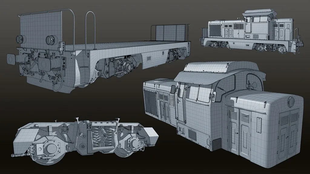
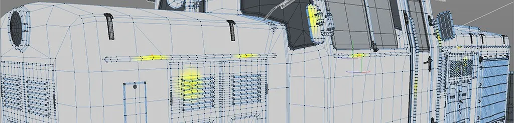
Wireframe
Here you can see a few wireframe renders of the train model. This is the first subdivided level base model at less than one polygon density.
Step 2: Texturing, Sculpting
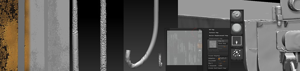
ZBrush tools and displacement
Detail sculpt
These two parts were worked together. I created texture details that were transferred as displacement details to ZBrush. ZBrush gives me Cavity and Normal maps to enhance the diffuse color details. I used a TrimDynamic brush to smooth and distress the necessary edges and corners on the elements. I did a soft wave/noise effect on the plate parts. I used the Standard brush with Scatter Projection mode. When you use these brush tools do not forget to switch on the Backface Culling parameter in order not to create unneeded detail.
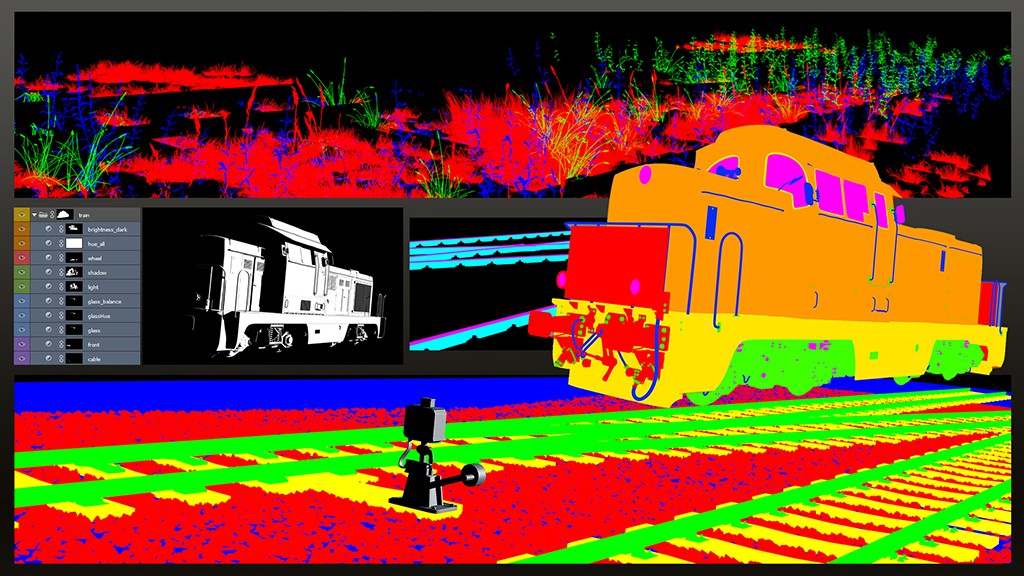
I separated the whole train into four different parts. A Body section with 6K texture, a Hull part with 4K texture, a Wheel part with 4K texture and a Detail segment with 3K. I wanted to use displacement as fine damaged edges, so these displaced elements were in the detail group. These geometries were further subdivided and had a more balanced topology for displacement calculations. Other parts of the train were created only with Normal maps.
Material groups
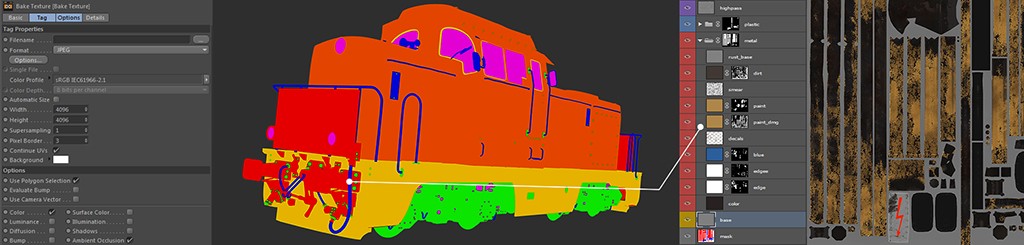
Observing the layers of the Diffuse texture I wanted to represent the structure of the red plate part here. I believe the first basic layer should always be a 50% gray one. It helps so much to handle color tonal strength and base color/detail balance. This is necessary because we see the color tones differently depending on whether we have a black or white background. The 50% gray layer also helps us during the shading phase when manually creating bump and displacement maps. The next step was the creation of material and UV masks for painting and procedural calculations. By this time I’d created many polygon groups with different colored shaders. It helped to create material groups inside each UV set. This masking process was also very important in the compositing phase so I could create gradient masks more easily.
Substance masking
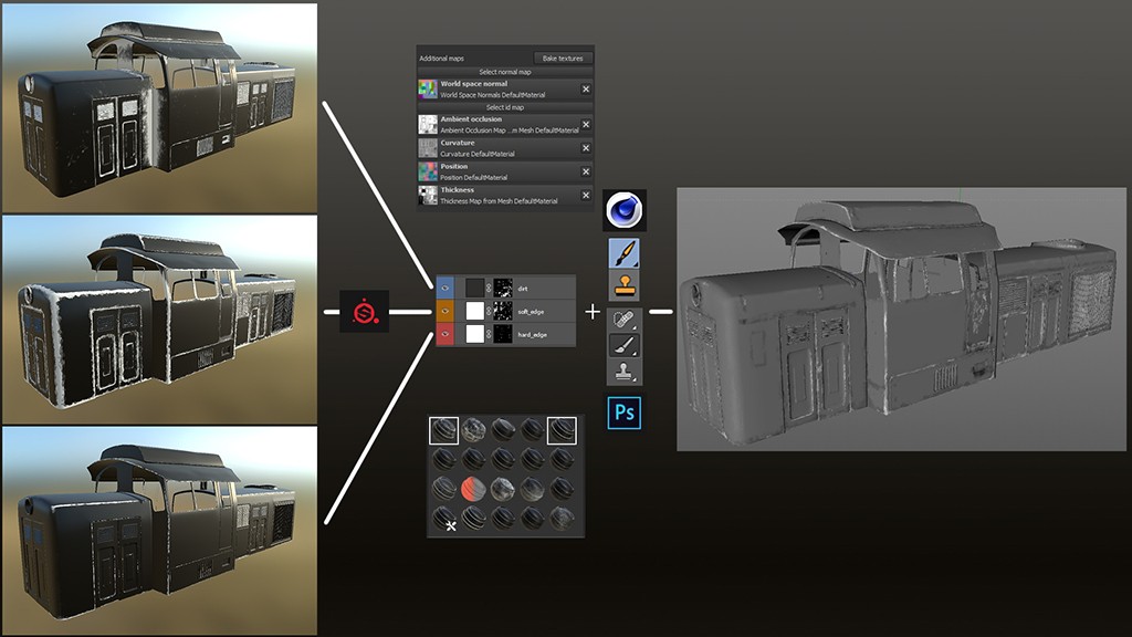
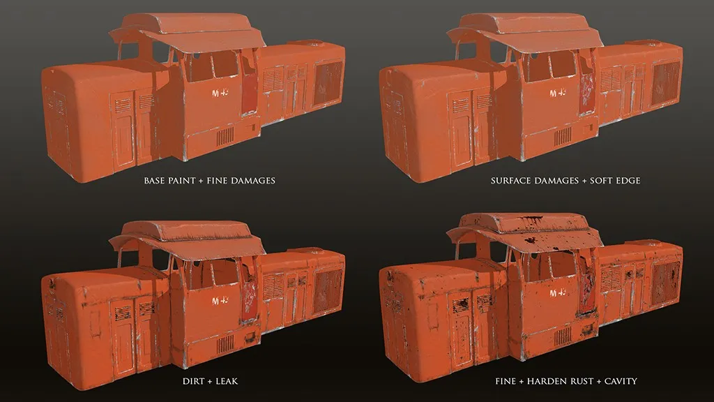
The next phase was mainly procedural. I used Substance Painter to get edge abrasions, damage and dirt masks. I used a simple fill color layer and a basic generator to get create them. I used the edge damage generator for edge masking, and dirt for dirt masking. I think generator names are self-explanatory. I only played with contrast and amount of effect parameters inside the generators. These worked awesomely with only a few fixes necessary by hand painting. I also painted additional dirt that was not in the geometry while baking textures such as Ambient Occlusion and Thickness to simulate mud/dirt on the surface.
Texture components, layers
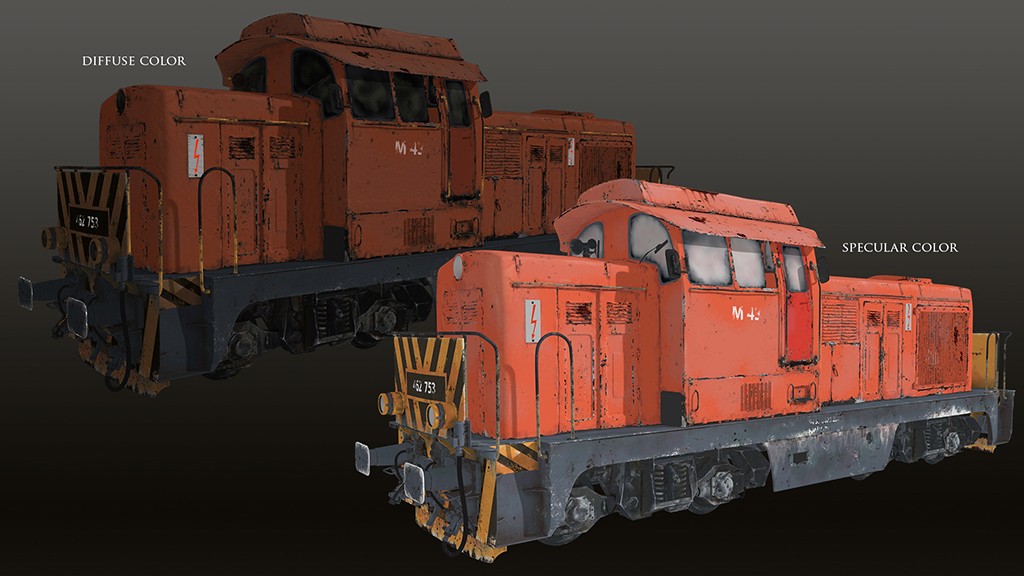
Diffuse and Specular
I added blue color over the orange to decrease the colour tone saturated by environment changes. It worked best in Specular color. I also added leaks and rusted parts for the color. I was careful with paint and edge damage not to create leaks, and used dirt over them too. I showed the texture contents in four simple steps. The last step was a High Pass layer which provides a material structure layer in Overlay mode to get tiny details and material traits. When I finished the diffuse paint, I created the required textures for Shading, Diffuse, Specular Color, Roughness/Glossy, Reflectivity, Normal/Bump (16 bit), Alpha and Displacement (16 bit) for each object.
Materials in scene
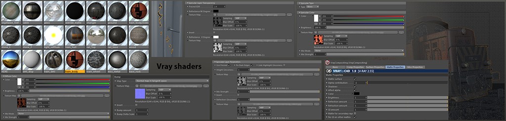
I used the V-Ray render engine to create elements for the scene. I used simple V-Ray materials with Diffuse, Glossy, Specular, Reflectivity, Normal/Bump and Transparency. For the material settings I can’t give much guidance as they always depend on lighting and object position. The important part of shaders is the Fresnel effect. It means how a material behaves at the point of fall-off. Almost all of the materials behave differently depending on which angle you are looking at them from. For example, basic metals become darker, and plastic and wood are brighter. This strength of fall-off effect can be calculated with Fresnel.
I also used Two-Sided Materials in rendering. This is very useful with flat 2D objects. This Two-Sided Material generates fake thickness for 2D objects to make them 3D geometries. This is necessary because CGI objects have a normal direction— “positive” and “negative (backface)” side—which determine a surface’s orientation toward a light source. The Surface Normal feature depends on an outer and inner surface of the geometry, so if the geometry is closed then each normal has a positive, outer side. When an artist creates a cloth simulation, hair or particles, the simulator/generator relies on the surface direction (the “real surface of an object”). In the case of cloth simulation, light does not pass through the collider mesh (particles move in only one direction), so render rays stop at the surface. There are exceptions to this such as Sub-surface Scattering (SSS).
Step 3: Creating 3D environment
Env. look
Environment elements
The environment contains more elements than the train. The challenging part of this was the railway and the stony field. These required lots of computing power. I had created four types of low-poly stone fragments with simple UVs. I used Scatter Object on a Plane object which worked perfectly to get the rocky field effect. Over the rocks I created a plank-wood line as the base of the railway. Finally, I created the rail itself as a simple 2D object that was extruded into a 3D mesh. I created a 50m long rail section with wood that was cloned in a line. I used a Bend deformer to achieve the bending in the scene. The rail-changing section was made by hand and had specific distortions and unique rail elements. The rail changer is a central focus of the scene, and other line parts were added to serve the scene. Grass patches and other vegetation were created in a similar way to the stones. I used the Scatter object on the same surface as before, with the only difference between the vegetation and stone scattering the polygon selections. I used random-sized polygon selection groups to create dense and less dense grassy areas.
These scattered elements required so much PC power that I had to use them as a reference object which meant several parts of the final scene were included from another scene. These are for example the grass, stone field and plants. Shaders of these elements were contained inside the separate scene so if I wanted to modify any part I had to work in different files. It helped the GPU by handling fewer polygons and textures at the same time.
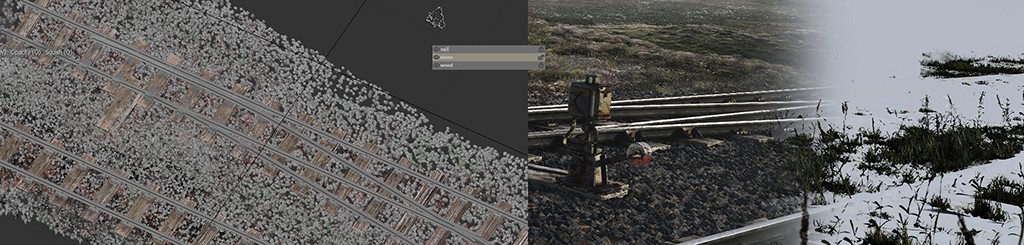
Railway dirt
I used Mari to paint the hundreds of stone surfaces and Paint Merge dirt between the wood, rail and stones. I only used colors to get this effect which worked perfectly in the scene to connect surfaces and detail variations. The railway and grass elements were rendered in different passes and made it easier to apply gradients and other post effects later.
Step 4: Lighting
Scene look dev
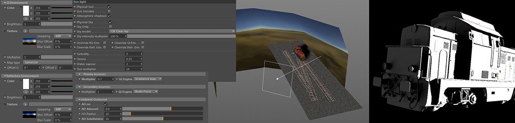
Simple light rig
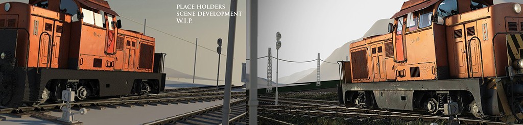
Lighting is very important for every scene. Here it is the fourth step in the process, but the truth is if we have a good eye and a draft light rig then the final result will be close to our initial. The light rig depends on the direction of objects, the camera angle, the composition, so every part of the scene is connected with every other part. There are no standalone elements in any kind of pipeline. Place holders, proxy geometries, basic color elements are always recommended when you are developing your scene. When you have an idea for an object and the way you would like to present it, think about the lighting first.
In my scene I used a simple infinite light as the sun. I used a HDRI image to override Global Illumination (GI) and environment reflection. I used a plane object with a self-illumination shader which also contained the HDRI image. This was used as a backlight which helped to highlight the shapes and fake a global environmental GI effect.
Step 5: Supporting the scene, additional environment
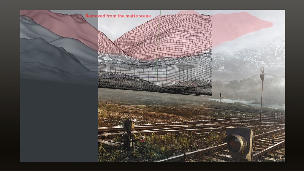
Additional background/matte-painting
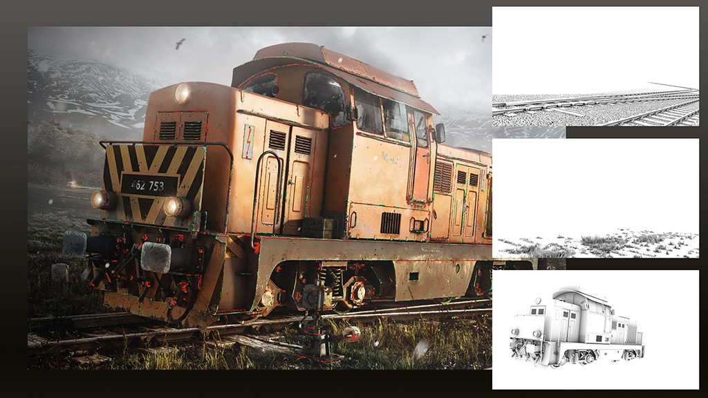
I used as simple terrain object multiple times to create a placeholder/guide geometry for the background painting. This was essential for the matte painting phase and helped in look development to capture the perspective. It was also really helpful in pre-lighting, light/shadow pass calculations. In the original 3D scene, I created towering mountains but they did not work in the final comp. The train needed more space to demand attention so they were removed.
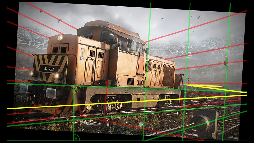
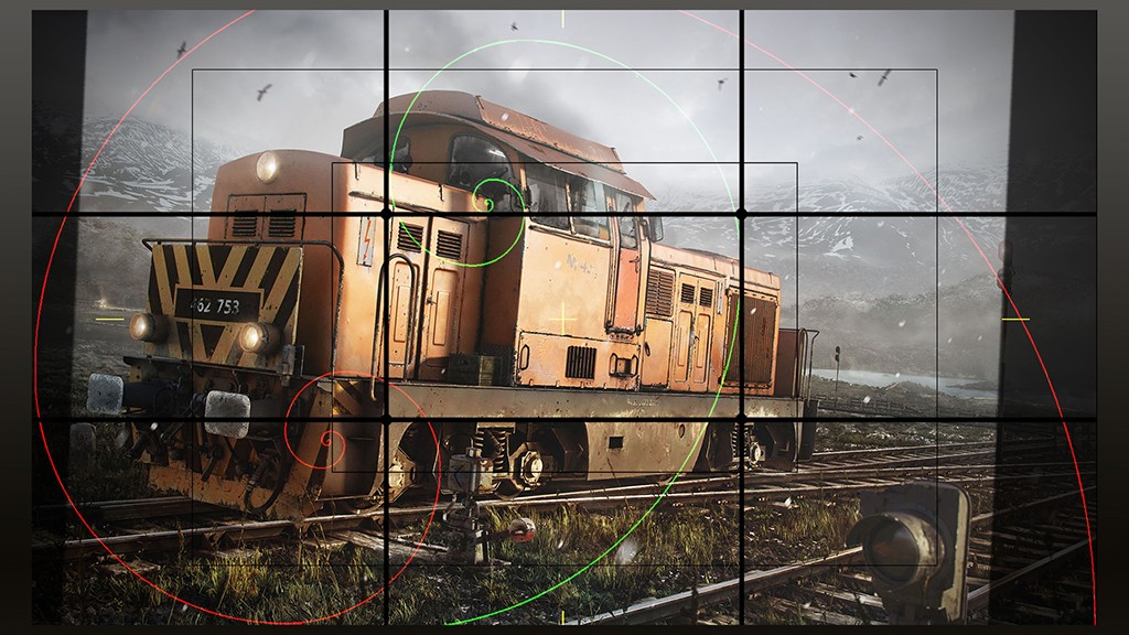
Force lines
Force lines are very important in every scene. These guide the attention to help the storytelling of the event. I wanted to create a subtle confusion inside the scene, so I rotated the axis by a few degrees. I used distorted perspective to connect the train’s main focus line to the bottom edge of the image frame. Green lines represent this, and red lines show the direction of each of the additional elements in the scene. These lines were calculated to direct the attention to the train. Finally, the yellow line shows the always epic “S” composition in the scene.
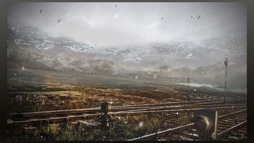
Single background
This is the background landscape without the train.
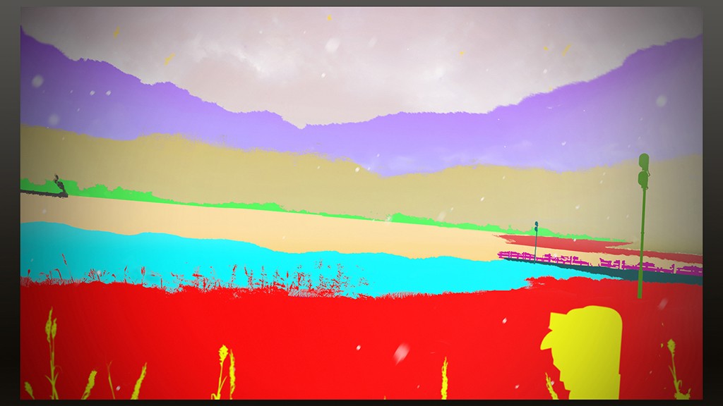
Matte-painted elements
In this image we see how many different content layer groups were used in the scene. The yellow parts are the elements in Defocus. The red part is the main 3D parts of the scene. Turquoise and purple parts are the secondary 3D elements of the scene. The lighter blue part is the closest matte-painted elements which need to connect with 3D elements properly. The tan part is the middle of the scene that is separated by a tree line in green. The darker red area is the line of river. The purple section is the high mountain area. Finally, the small black area is the other matte-painted train.
Step 6: Composition, depth, grade
Composition
Composition is the hardest and most important part of creating an image. Lighting is also important as it will immediately lead the viewer to judge whether it is a good or bad image. Everybody has a feeling for how a scene should look. An artist can dedicate many years of study and experience to develop the ability to create a full scene around a single object. There’s a lot of software now available that is very helpful for scene creation. There are also the basics to rely on like grids and the golden spiral to find good placement of important objects and details. I used two golden spirals for this scene—a green one as main and a red one for environment calculations. For the best outcome I sometimes change the scale of 3D objects, as well as length, height etc. Objects are used to serve the scene, not the inverse.
Atmospheric depth
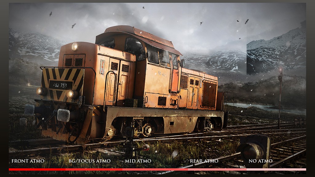
Atmosphere is one of the best methods to create dimension and depth inside an image. It is mainly de-saturation and loss of contrast that makes one space appear distant from another. When creating a scene, the de-focus effect is always helpful. It allows us to focus the viewer’s attention on one object or a group of objects. The details that are not important will be de-focused. Same with lights, if we see something in bright light, the eye narrows the iris, creating a glow effect around silhouettes. When we turn off the lightsource, eyes need time to accept low light photon impact to see something again. These effects help to create more realistic CGI and add Z-depth for the scene. In this case, I used four layers of depth. These are simple black-white gradient maps. I also used soft glow at the top of the train, because the sky is bright enough to contrast the train. This one is a paint layer with soft alpha brush, with a 15% opacity.
Contrast tone guidance
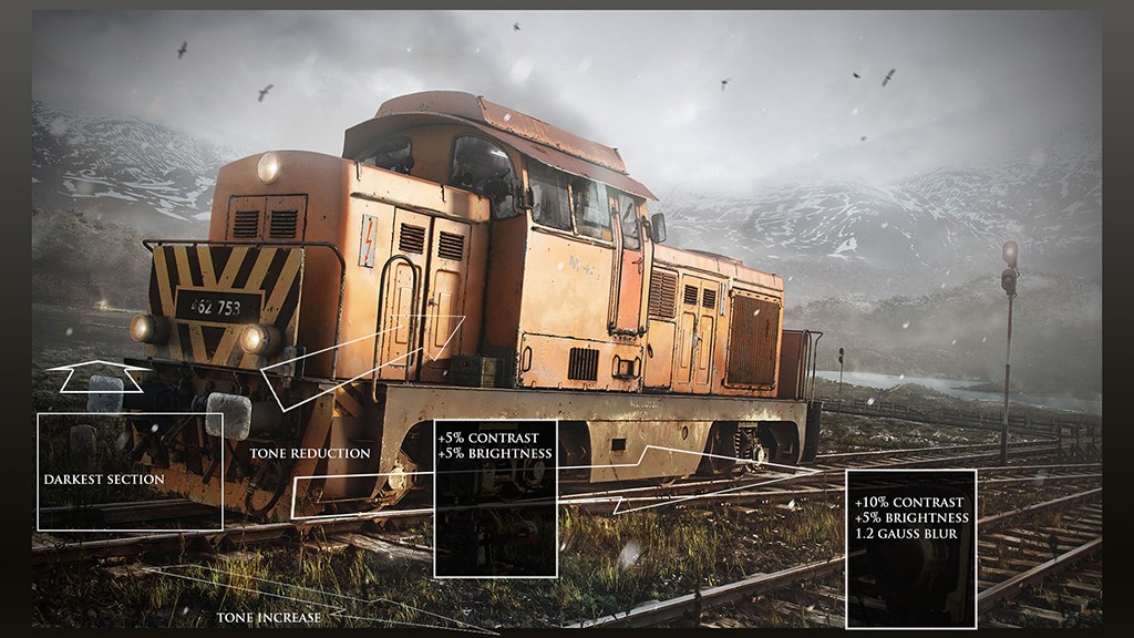
As with saturation, working with contrast produces a similar effect to atmosphere. With the darkest area, I wanted to define the first point where a viewer would start to “read” the image.
Grade masks
These elements are the same as material masks. I used many colors to define the separate parts in the scene.
Close-up enhancements
When using highly-detailed textures these details can often be lost during the rendering process. If we are working on larger-sized images, we then have to enhance the image where those details will be missed. I marked the fine highlights in green and dirt layer in red. These details are only visible at full resolution or when zoomed in, but they are needed to achieve a realistic look. The enhancements rough up the edges a little to make them look more natural. Ambient occlusion is an other enhancement for the fine details in the scene by creating a nice gradient effect between highlight and shadows. It does need to be used sparingly, as too much ambient occlusion created a cartoony effect.
Post effects
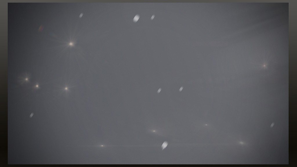
The last step was to add post effects to the scene which were Vignette, Chromatic Aberration, Lens flare and Light rays. I also added falling snow which are simple white dots with motion blur.

Final image
Thank you for reading my short making of. I hope you enjoyed it! Check out my ArtStation portfolio.